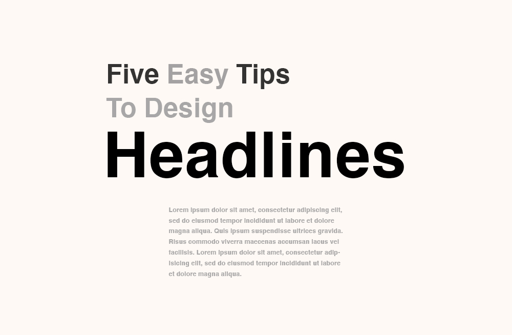
Headlines are the meat of any written communication - whether it's a news article, blog post, or sales report. They are also the hardest part of any design. A clear and well-designed headline encourages readers to find out more or skip the rest altogether.
With these simple tips, you can improve your headline design:
1. Almost Never Use All CAPS
A general rule here is that headlines in all caps hinder readability and take up extra space that readers need to rest their eyes before diving in.
In written communication, text in all caps can be perceived as
unreasonably loud. In visual communication, large body copies or long
sentences in all capital letters are hard to read. They are too monotonous and uniform
for the eyes to follow throughout for a long.
Unless you can strongly argue for the use of all caps, drop them. Headlines in title cases usually do better than those in all caps.
Of course, as with every rule, this one is not set in stone. If you decide to employ all caps, read the next tip.
2. Adjust Tracking
Tracking is adjusting the letter space across the entire word. It's as important as picking the appropriate font. Adjusting the tracking in headlines, especially in uppercase and condensed settings, greatly improves readability and gives readers a typographic rhythm to keep reading.
Oftentimes, I choose to space letters further apart as a way to create some extra white space for readers to rest their eyes before moving on to the next line. A slight and even letter-space adjustment is an easy and essential practice, especially in print.
3. Increase Type Size
Changes in a headline type size can command attention like no other. If you were to change only one element to design a better headline, then increase its size. Make it larger. I would normally make it at least two times larger than the body copy. And then increase some more. It is an easy solution to establish a clear hierarchy and create an initial interest.
4. Use Monochromatic Colors
Monochromatic colors are different tints and shades of a base hue. They create soft contrast and are the easiest to mix and match for an untrained eye. You can go a few hues up or down on a monochromatic range, and those variations will always work well together and feel right. If Red is your base color, Maroon or Blush can be complementary, giving you a safe option to experiment.
Combining monochromatic colors can feel less intimidating than designing with complementary colors that sit opposite each other on a color wheel. When in doubt, choose a lighter or darker version of a base color. A simple tweak to the headline color can change the look of the entire page as well.
5. Contrast
When you complete all the previous steps, take a step away from the design and examine the layout with a critical eye. Take a look at the big picture as a whole rather than its individual parts. Does the contrast between all the elements look intentional and clear, or is it too subtle and may seem like a mistake? Is a page more visually appealing with this font case? Font size? Color scheme? Tracking adjustment? Design is often a gut feeling. We know intuitively it will work before we consciously can explain why.
Bonus:
6. Explore Glyphs
I’ve been using these tips to design not only headlines but also titles, quote inserts, and logos to create a visual hierarchy and emphasize any important notion in the body copy that viewers will most likely overlook otherwise.
Remember, as with every rule, sometimes they fail. Some layouts require all-cap headlines. A flyer design may call for a complementary color scheme instead of a monochromatic one. One size doesn't fit all. Make peace with it, and enjoy the process.
That's my tips. If you have some tricks up your sleeve about how to design better-looking headlines, please share them in the comments below.


Comments
Post a Comment